Squarespace vs. Pedestal vs. Wix: Which Is Right For You?
Online web builders enable you to build a high-quality, well-designed website at very low cost and without technical expertise. The problem is, there are so many online tools and builders available that making the right choice for your needs and priorities can be tricky.
Many of these builders, such as Squarespace, Pedestal, and Wix, come packed full of features, have excellent reviews, and employ brilliant marketing. So, which is best? It’s a simple question with a not so simple answer: it really depends on you. Each of these builders has a different ‘value proposition’ that will suit different customers.
For example, Squarespace may be the perfect platform for a budding freelance writer but would add a lot less value to a small plumbing company.
This article will help you see the technical specifications to get to grips with which platform is best for you, comparing three of the highest quality website builders: Squarespace, Wix, and Pedestal.
In a hurry? Here are the key takeaways:
● Squarespace is a design-focused builder with a small selection of high-quality templates and tons of customisation options. If you’re somebody who needs to showcase your work to drive custom, Squarespace and its stunning visuals are for you.
● Pedestal combines design and marketing elements into one central tool to create good-looking websites with built-in marketing tools and actions. If you’re a local, service-based business, Pedestal and its sales ‘brain’ are for you.
● Wix is a very intuitive and affordable website builder. It is trusted by millions and has an easy-to-use drag and drop interface. If you’re a hobbyist or working on a passion project where sales aren’t key, Wix and its ease of access are for you. It’s flexibility also makes it a good choice for businesses who aren’t better served by the other two options.
Hungry for more information? Below we will lay out the case for each of these builders, looking at both their strengths and their weaknesses. By the end of this article, you should have all the information you need to make an informed choice and start testing a solution.
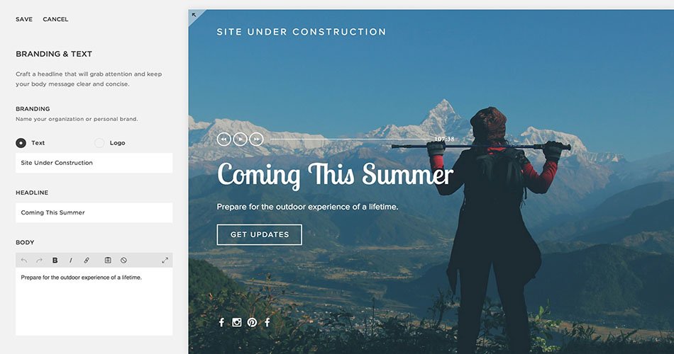
Squarespace shines when its used as a visual showcase of a business or a person’s work. It’s a fantastic option if you want to build a customised, visually-appealing hub that’s beautifully laid out and designed to draw customers in. With a smaller choice of templates than other website builders, Squarespace has focused on quality and customisability over providing users with many pre-made options upfront.
This strength in quality is also one of Squarespace’s biggest weaknesses; the comprehensive customisation options need a significant time-investment to use to their full effect. New users can feel overwhelmed by all the options, and this can detract from the supposedly intuitive and simple process.
This is what makes Squarespace our recommended option for freelancers and other design-oriented businesses – but a potentially poor choice for other users. For design businesses, showcasing your work is absolutely key – and Squarespace shines in this scenario. Additionally, these users are more likely to have the design skills necessary to take advantage of everything Squarespace has to offer. Less design-savvy users may struggle to make use of all the customisation options and may benefit from a simpler option, however.
A basic Squarespace site starts at $12 per month and eCommerce plans start at $26 per month. All plans have hosting included. A free trial is available, but the website won’t be live until you’ve signed up for a paid plan.
What the users say:
“Squarespace creates beautiful, responsive websites that work on computers, tablets and phones. If you are a beginner and are happy with the Squarespace templates, you can create a great website that looks like a pro designed it.” Andy A, Trustpilot Review, Dec 2017.
Templates and Visuals
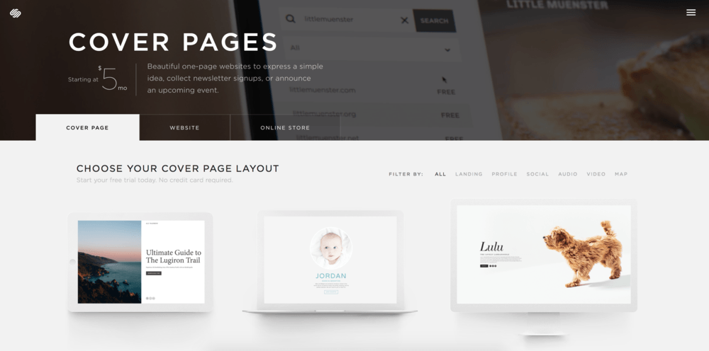
When you build your Squarespace site, you are given a choice of dozens of very high-quality templates which form the backbone of your site and which you can then build on. With names like Aubrey, Haute, and Galapagos you might be expecting something high-class – and you wouldn’t leave disappointed. It is clear from the appearance of the templates that significant thought has gone into creating something that looks great. Designed for a variety of industries and functions, they allow users to quickly put together striking landing pages that convey an air of professionalism. Used correctly, these templates can significantly enhance the aesthetics of the work you choose to showcase on there.
Customisation
Just a few dozen beautiful templates? With hundreds of thousands of businesses using Squarespace, you’d be forgiven for worrying that your website will look like just another brick in the wall. This is where Squarespace’s in-depth customisation options come into their own. Users can adapt their template, altering colours, fonts, background images, image opacity, sizes, spacing and much more besides to create a unique look.
Responsive Design
More than half of all internet traffic now comes from mobile and tablet. It doesn’t matter how good your website looks like on a desktop browser if mobile customers get a poor experience you could be losing at least half of your business. Here, Squarespace stands out again – it looks great on desktop, tablet or phone, with no need to create supplementary sites that are friendly to different platforms. Our other two choices also offer responsive design but can’t match the beauty of Squarespace in any of the formats.
eCommerce
Squarespace includes comprehensive eCommerce features (at the higher payment tiers) which make it the preferred option for online stores (Wix includes basic eCommerce functionality, while Pedestal has no eCommerce options). Businesses which run large online stores will find it far quicker and easier to manage their store using Squarespace than with most other web builders.
Time Invested
Squarespace has many positive reviews, but there’s one message that comes through again and again – it just isn’t quite as intuitive as it sounds. The idea of a drag-and-drop interface certainly sounds appealing, but for many, it seems that this description is an over-simplification. Wading through the many options can be time-consuming and using them to improve your site is certainly a trial-and-error process. So, if you want a website that really reflects you or your business in a highly personalised way, you will achieve it, but not in half an hour.
Overwhelming Customisation Options
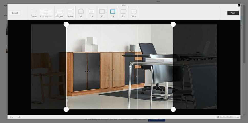
Most people who use website builders of this kind do so precisely because they’re not tech wizards. They want a good-looking website that does them or their business justice and drives sales. Agonising over aspect ratios is not the best use of their time, and for some, the amount of choice can be paralysing. In fairness to Squarespace, this is something they have taken on board, and some templates offer only minimal customisation options to keep things simple.
Secondly, rather than targeting everyone, Pedestal just focuses on helping local, service-based businesses. By targeting specific industries and placing the importance on intelligent, consistent marketing, Pedestal can confidently claim to bring a significant marketing boost to its customers. The flip side, of course, is that these tools aren’t suitable for everyone.
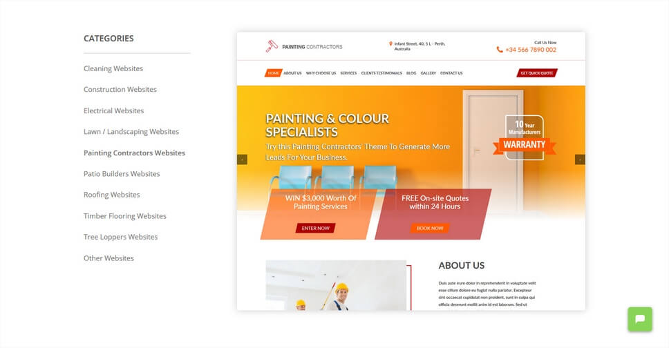
Pedestal is built with a huge array of pre-set templates based on industries, ranging from construction to acupuncture and veterinary surgeries. It is certainly not as adaptable and customisable as a builder like Squarespace though, as local marketing is the key focus, rather than customisation – many design choices are made for you to ensure you are using design best practice and maximizing your ROI. This makes it ideal for businesses that want a converting website, but don’t know how to go about creating one.
Pedestal is aimed squarely at the business market and is available on an initial 14-day free trial (you can create a test site, but not publish it), and then for $49 per month. Annual subscriptions are available for $500 per year.
Built-in Marketing Features
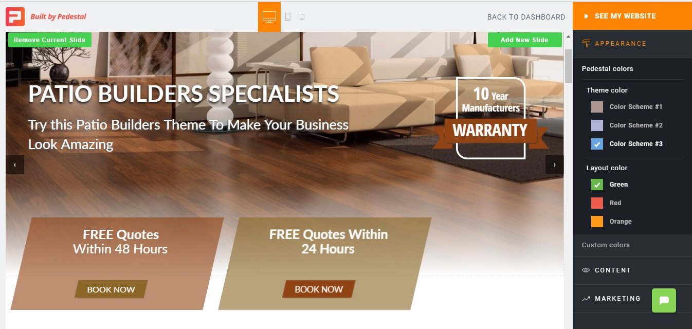
Right from the start, Pedestal is working to optimise your marketing. With just a few clicks you can add pre-designed customer offers and engagement techniques. Even if you don’t already have a defined marketing strategy, Pedestal will take your business and run with it, getting the brand out there and drawing in customers. Pedestal makes it easy for you to add industry-specific guarantees or warranties, time-specific on key offers like quotes or assessments, competitions to draw in large pools of customers, and much more.
Industry Customisation
One of Pedestal’s main strengths is the pre-optimised templates it provides for the industries it serves. These templates are highly tailored to each industry, greatly easing the setup and management of an effective industry website.
The included graphics and visuals reflect themes in the industries; soap bubble designs for cleaning companies, bricks for construction and so on, lending a personalised and professional touch.
Marketing and Sales Tracking
With Pedestal, a small business owner can track their marketing activities against content engagement and service sales. Tracking all of your online marketing in one place gives the small business owner vital oversight while saving time and reducing the need to learn multiple complicated tools.
More limited functionality/customisation
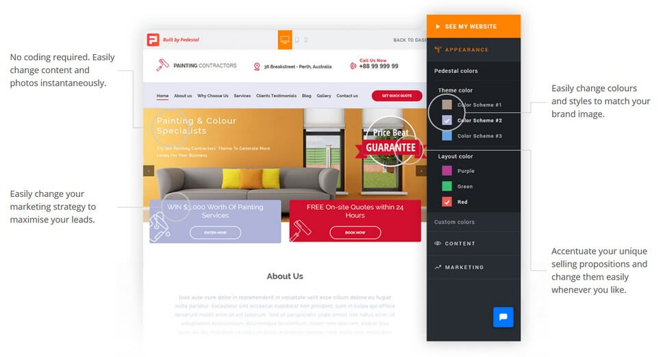
Pedestal’s industry-specific templates are pre-built to a greater extent than those of other builders, which means that there are fewer customisation options available. For the industries Pedestals serves, this can be an advantage – businesses have less work to do to get a converting website online.
However, for other users (and anyone who has a specific design in mind), this lack of customisation options can be frustrating.
Wix is an excellent general-purpose web builder that is well-suited to people who want a simple interface. The drag-and-drop interface is easy to use and arguably more intuitive than either Pedestal or Squarespace.
Wix is also affordable, both in monetary terms and in time invested, as its intuitive set-up lets you hit the ground running without a great deal of learning (assuming you are reasonably computer-savvy). However, the templates can be a tad inflexible, and the lower-level price options will leave your page somewhat compromised by prominent advertisements.
The lack of built-in marketing tools and fewer design features means Wix is a poorer choice for local service businesses and design businesses (which are better served by Pedestal and Squarespace respectively). However, Wix’s large store of apps makes it more flexible than Pedestal and easier to use than Squarespace, making it the ideal choice for businesses or individuals who do not see the other two solutions as a good fit.
Wix’s free account includes 500 MB storage, hosting, and unlimited pages (but also comes with advertisements). Premium plans start from $5 per month with the most expensive costing $25 per month, with increased features as you pay more.
“Brilliant - absolutely brilliant. I'm not hugely web savvy but I really liked the easy to use interface from Wix. I've spent the evening creating my new website based on one of their templates, and have now subscribed.” Jonathan Whelan, Trustpilot review, Feb 2018.
Intuitive Interface
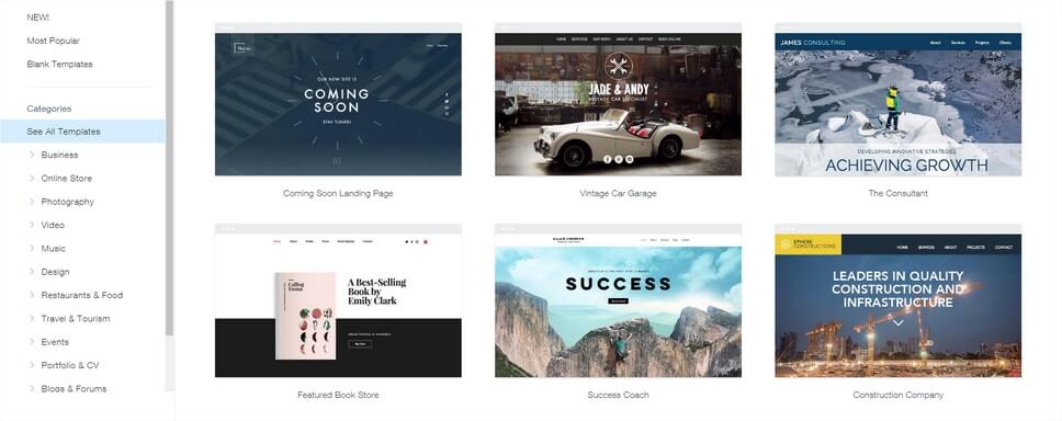
For our money, Wix leads the way in offering an easy to understand and simple to use design interface. Starting from one of their huge range of templates, you can immediately begin dragging and dropping graphics, texts, and other elements to create your design. The large library of pre-populated templates features sample content which you can quickly and easily replace with your own, making it quick and easy to get a good quality website up and running.
Affordability
Wix will allow you to design and publish a live website free of charge, and their more comprehensive paid plans are very affordable, starting as low as $4.50 per month. You will also save time invested as the easy to use software does not require you to devote time to developing skills and knowledge.
Some inflexibility
It’s easy to get up and running using one of Wix’s many templates, but what happens when you want to switch your content over to another layout? Unfortunately, switching is not nearly as easy as the initial setup. Changing to a new template won’t allow you to carry the existing set-up over and you’ll need to start from scratch. This inflexibility means you need to think carefully before you commit to a template.
Pay to avoid prominent ads
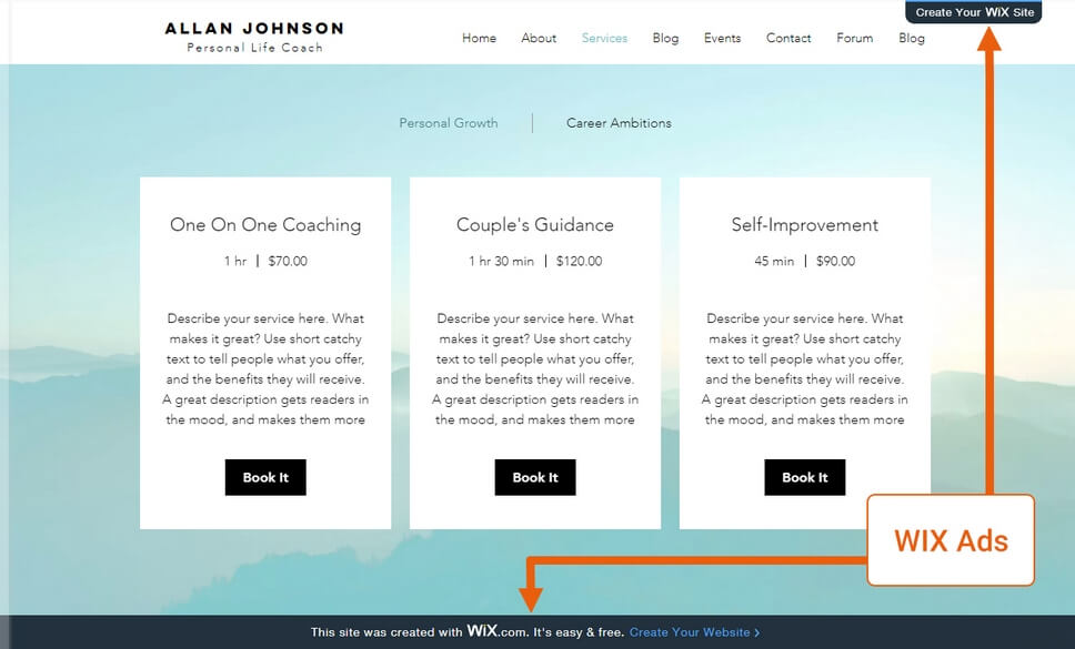
While a free domain and live site sound great, you pay for it in a different way: Wix puts prominent advertising on your site. You’ll need to upgrade to a paid plan to get rid of it. For individuals and hobbyists, this might not matter, but businesses will definitely want to upgrade rather than risk compromising their brand message.
As you can see from our reviews, there’s something to like about each of these three options. Your choice between Squarespace, Pedestal, and Wix very much depends on how you want to use your website.
Our table below summarises our recommendations and should help you to decide which is best for your needs:
|
Who are you? |
What value do you need from a website? |
Which builder is for you? |
|
A freelancer, a business in the creative industry, or anyone who wants to focus on getting the design of their website just right. |
A place to showcase your work, drive interest and sales. |
Squarespace |
|
A local service-based business, such as a plumber, electrician, or lawyer. |
Design and marketing options that will enable you to convert visitors into customers. |
Pedestal |
|
A hobbyist, working on a passion project, or a business that does not fit into one of the above categories. |
An easy-to-use builder that lets you simply and affordably build a site. |
Wix |
Each of these web builders offers a free trial. Your next step is to choose a solution, start a free trial, and evaluate that web builder for your project.
Not sure you’ve seen the right web builder for your small business? We review a few more options in this in-depth article on choosing a web builder.